
When it comes to website design, creating a page that is visually appealing, aligned with your brand, and optimized for lead generation is no easy task. After all, there are a lot of mistakes you can make in the process.
That’s why — for almost two years now — my team here at IMPACT Branding & Design has been hosting a monthly live website critique called Website Throwdown. Our goal is to help people recognize and correct some of those mistakes, while educating other viewers in the process.
The best part? We critics happen to learn a thing or two about marketing, UX design, and conversion rate optimization (CRO) in the process, too. It’s a win-win. So in the spirit of education for all, I’ve recapped the top 10 CRO lessons IMPACT has learned after critiquing over 100+ websites below.

P.S. – Want your website critiqued in person at INBOUND 2016? We’re hosting a live throwdown in Club INBOUND with the help of special guest like HubSpot’s Luke Summerfield and The Sales Lion’s Marcus Sheridan and George B. Register for INBOUND and then reserve your throwdown slot here.
The Top 10 CRO Lessons One Agency Learned After Critiquing 100+ Websites
Lesson #1: Too many brands are hiding social proof.
So you’ve worked with some highly respected brands and they couldn’t love you more — why aren’t you screaming about it from the rooftops?
After critiquing over 100 websites, we found that a surprising majority of brands hide their social proof far down on their homepage or worse — isolate it to a never-seen page in their navigation.


Bring industry proof to the forefront. That helps build trust and credibility instantly. #WebsiteThrowdown
— IMPACT (@Impactbnd)
September 29, 2015
Nothing speaks more highly of your work than word-of-mouth and by hiding this powerful information where visitors are unlikely to look, you can risk it going completely unnoticed.
To get the most out of social proof, incorporate elements of it into your homepage design where your visitor’s attention is at its highest. (A heatmap from Hotjar can help you determine where this is exactly.) Doing this will help you make a strong impression and immediately establish credibility in the eye of the reader.
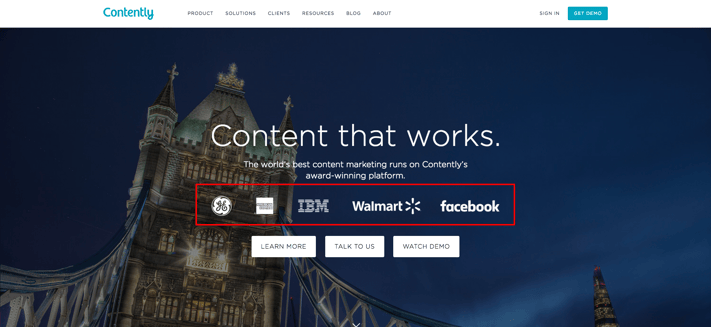
Take a look at Contently, for example. On its homepage, the content company shows off who has used its platform before even asking you to watch a demo or learn more. Leading with this social proof builds trust and makes the visitor think, “if it worked for them, it’ll work for me.”
Elements of social proof you can consider incorporating into your homepage include:
- Partner/Client logos
- Testimonials
- Awards
- Certifications
- Reviews
- Affiliations
- Social Followings
Lesson #2: Real photography is underappreciated.
“Stock photos of people should never be used to represent your customers or your employees. Lose them,” commented David Meerman Scott during one of our live critiques. (He’ll be critiquing websites with us live at INBOUND, too.)
Now, you’re probably saying, “but, but sometimes I need to use stock photos.” And I get that — especially when you don’t have the budget for a photographer, or you’re in a time crunch. But with so many organizations using generic stock photos prominently on their websites, investing in real photography or custom graphics is an easy way for your company to establish credibility and stand out.
Using authentic, real photos of your team or office can help frame your business in a more genuine, relatable light. This can make visitors feel like they actually know you, and in turn, make them more comfortable doing business with you.
HubSpot does a great job with this, capitalizing on their real employees, rather than stock models on every page of their site.

↓

Moral of the story? If you have to use stock photos, choose them wisely — avoid results on the first page, look for unique shots, and steer clear of anything overly cheesy. (If you need help, here’s a list of quality stock photo sites to get you started.)
Lesson #3: Bring differentiation to the forefront.
If people can’t identify your company’s unique value within a few seconds of being on your homepage, chances are you’ve already lost their business.
Attention spans today are low. When visitors first arrive on your site, you need to tell them exactly what makes you different and why they should stick around to learn more.
One of the most effective ways to accomplish this is with a well-thought out and prominently placed value proposition that explains:
- What you do
- Who you do it for
- How you do it differently from your competition
In this article, I discussed how Slack nailed its value prop on its homepage. Just look at this breakdown:
- What does it do? It’s a messaging app.
- Who is it for? Teams.
- How does it do it differently from the competition? It makes working lives “simpler, more pleasant, and more productive.” (Plus, the team behind the Mars Curiosity Rover uses it … and that’s just awesome.)

Lesson #4: Imagery and messaging need to align.
Your imagery and text should send the same message to — and elicit the same emotions from — your visitors. For example, if your value proposition positions your company as the ideal solution for metropolitan corporations, don’t use photos of small business owners or a local business plaza.
Always connect your value proposition with your hero image. The message should be consistent. #WebsiteThrowdown #design #marketing
— IMPACT (@Impactbnd)
December 15, 2015
Using misaligned imagery like this can be confusing and send your visitors mixed messages — and nothing manages to cause conversion friction quite like confusion.
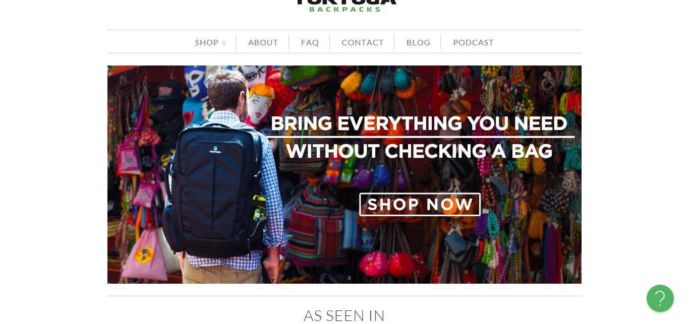
Tortuga Backpacks does a commendable job with this, showing a customer wearing its product in a colorful market. The image evokes thoughts of travel, while the copy addresses a common travel pain point: checking a bag.
Lesson #5: Conversion paths must be clear and direct.
As obvious as it sounds, another lesson we learned on Website Throwdown is that one of the best ways to increase conversions is by making your path to conversion as clear and direct as possible.
Visitors can make the decision to convert or purchase at any time, and when they do, brands like yours need to make sure that the ability to do so is easily accessible.
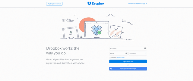
One company that’s truly mastered this is Dropbox. With a “Try Dropbox Business” call-to-action in its sticky hello bar, the cloud storage company ensures that no matter how far you scroll down the homepage, you have a conversion point within reach when you need it.
Lesson #6: Avoid carousels and sliders.
If you’re considering a slide or website carousel, click here.
No but seriously, whether it’s HubSpot’s Austin Knight, CMO Kipp Bodnar, or Copyhackers Joanna Wiebe, the sentiments have been the same on Website Throwdown: carousels aka “sliders” have got to go.
Not only do these once-popular homepage features hide messages and take control away from the user, but they can also overwhelm the user, bombarding them with too many options at one time.
When it comes to your website, each page should have one main message and one main goal for the visitor. And pulling them in different directions with multiple propositions and CTAs in a carousel will only lead to analysis paralysis — and ultimately even fewer conversions.
Lesson #7: Video is a huge advantage.
In Crayon’s 2015 State of Video report, the company found that video appears in 70% of the top 100 search results, while websites that incorporate it tend to see two more minutes of on-screen time than those that don’t.
Simply put, this means that video is powerful.
It grabs your visitor’s attention in a way that text alone cannot and adds more dimension to your brand. Video allows you to put a face and voice to your brand, making it more human. It also allows you to communicate more information about your product, brand, or culture in a shorter amount of time.
The quicker you engage and explain your value to website visitors, the more likely they are to stick around and take action.
Lesson #8: Don’t force visitors to think.
Like I mentioned in lesson #6, giving your visitors too much information can lead to inaction — that’s because you’re forcing them to think.
As Hotjar’s Tara Robertson said on last month’s Website Throwdown, “the last thing you want someone to do when they land on your homepage is think.” People don’t like to think unnecessarily and quite frankly, it can only lead to over-thinking.
As a brand, you don’t want to burden people with the task of interpreting multiple messages or options to determine their next step. Rather, you want to focus on one action that you want taken and tell them exactly how to do it with clear copy and calls-to-action.
Streamlining your messaging and telling visitors what they should be doing next reduces confusion and friction, making it more likely that people will convert.
Lesson #9: Clear goes further than clever.
Now, I love cheeky copy as much as the next girl, but when it comes to conversion rate optimization, clarity takes precedence.
“When it comes to your navigation, focus less on clever phrases and be clear.” – @taraerobertson #WebsiteThrowdown #UX #CRO
— IMPACT (@Impactbnd)
October 12, 2016
Whether it’s in your headlines, navigation, or button text, always strive to be clear and concise with your copy to avoid misunderstandings and lost opportunities.
Any language you use on your website must resonate with and speak directly to your buyer persona in order to be effective and drive action. For instance, while labeling your product page “our masterpieces” may seem fun and quirky, if this is not a phrase that will be immediately understood by your persona and drive them to clickthrough, it shouldn’t be used.
Need help saying more with less? Try these six creative exercises for writing more concisely.
Lesson #10: Be human.
At the end of the day, even in a cold, cyber world, people want to interact with other human beings. They want to do business with those they can relate to — individuals who understand their pain points and concerns and will advocate for them.
In this effort, use your website to humanize your brand.
I can’t tell you how many companies we’ve encountered that talk about team members and collaboration on their websites, but never show a single face or name. This doesn’t do much for their credibility.
To avoid coming off cold, share real photos of your team members and show some personality. Include bios of your key team members, or even shoot a short video introducing them to your website visitors. Showing an authentic, personable side to your company can make visitors feel more comfortable doing business with you and yes, you guessed it, converting.
Is your website falling victim to any of the issues I pointed out above? Don’t forget to come meet the rest of the IMPACT crew at INBOUND 2016 for a live website critique. See you there!

![]()


